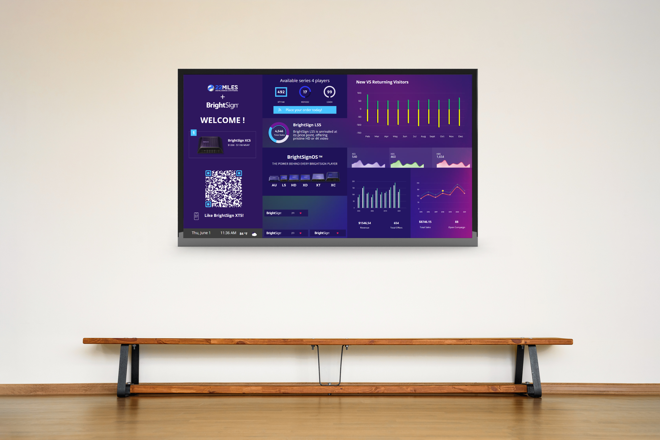
Designers always articulate the same few words to their creative approach methodology to sound more refined. Those are UI vs. UX or typography, palette and hierarchy, what does that all mean?Let’s start with website design and mix in digital to print. Within a website you have a user interface, the page with your layout or template. It’s the foundation for your creative landscape that defines the usability and user interaction.
The same is done within digital signage, and can be put into an interactive solution. To further expand on a good UI; Graphic design and typography are utilized to support its usability, influencing how the user performs certain interactions and improving the aesthetic appeal of the design; design aesthetics may enhance or detract from the ability of users to use the functions of the interface.
The design process must balance technical functionality and visual elements to create a user experience design that is not only operational but also usable and adaptable to changing user needs. (Thank you Wikipedia love to count on you to further decipher certain nuances in a good definition.) I felt that was a simple explanation that does not need to be cut but shared as is.
So from a good interface design derives the user experience. This to most digital or mobile graphic designers is the most important element. The UX or UXD is that element that enriches usability, accessibility and the users’ satisfaction. What distinguishes a good UI from a bad one is the experience a user has with it.
If you can’t figure out how to get from one subpage to another sub link or be able to read the body type or understand the different tones you have officially lost in the creative design approach. You could be shunned by those graphic design peers who all want you to believe their methodology is unique and meticulous and they will never produce a bad UX like you just did! I have personally come across a few of those who still think their special sauce is the end all be all to this creative digital world.
In my opinion the interactive solution in this photo shows a really bad UI and UX . The second you have to have a call to action with print signage to explain the engagement of a touchscreen, you know something is not defined through the UI to call you into it!
This is what NOT to do, and what you definitely did wrong if you have to add this component to your digital design.
Within every user experience design you’ll be told there needs to be levels of typographic hierarchy. Basically, a fancy way of saying visual arrangement of design. It’s a way you can visually communicate your design’s main idea and draw your attention to the header vs. the sub and body copy. Is this starting to make sense yet? I hope so I am really trying here… Let’s not forget palette which is the selection of colors that you need to make sure you choose correctly for your design. You don’t want your color scheme to be boring or too busy, you just want them be immersed in a palette that suits your content.
So with that in mind, within the graphic design creative world you need to know what you are saying to be cool, but yet there seems to be some sort of rationale as well. If you do it wrong you miss out on your message, your call to action, and your user’s satisfaction. The performance of your final user experience design could be lost to the pits of graphic design purgatory of shame and possible future business.
Humanity has always had a creative backbone, but would Da Vinci and Michelangelo be able to keep up with the complexities of today’s digital world? So remember that the design you end up with will define your creative solution and will either make it or break it for you. If you don’t adapt to current trends you will be left behind, so choose it wisely!


