SEGD references 22 Miles in collaboration with FD2S for UMN Health wayfinding design project
The University of Minnesota Health’s new MHealth facility in Minneapolis was purpose-built for facility flexibility and patient convenience, which presented graphic design firm fd2s with a unique wayfinding challenge.
The MHealth group was formed through a collaboration among University of Minnesota Physicians, Fairview Health Services and the University of Minnesota Medical Center. In 2014, the University of Minnesota Health was seeking an opportunity to reevaluate their care model, brand position and expenditures through a new facility, which would be home to the newly formed MHealth Clinics and Surgery Center.
Leadership’s biggest goal, however, was to improve the patient experience by building a facility that fused great ideas from the worlds of retail, hospitality and medical digital signage. The technology-enhanced customer service of an Apple store, for example, and the warm, comfortable interiors of an Aloft Hotel—with hours that suit the lives of working people to boot. The building would also incorporate natural light and views as much as possible for their calming effect, particularly in the surgical suites.
The high-touch hospitality approach with patients was also intended to be high-tech; the leadership team wanted every patient to be greeted personally by a roving, iPad-equipped concierge who would personally escort them to their appointment, giving them an RFID device that would track wait times and alert staff if patients were left unattended for more than 10 minutes.
Built-in convenience and efficiency of medical digital signage was of paramount importance for the clinics as well—MHealth and University of Minnesota Health wanted clinics and staff to be able to move around within the facility depending on the day or time based on patient load and doctor’s hours. Very few of the 37 specialty clinics would be fixed destinations to maximize the use of space. For example, a clinic may need 50 exam rooms three days a week, but on two they may only need 20, so the whole office may move to another space, or an adjacent clinic may use the vacant exam rooms.
The institution assembled a lineup for the ambitious project that included CannonDesign, Studio Five Architects and graphic design firm fd2s, inc. (Austin, Texas). The fd2s team worked in close collaboration with the architects and client group to define the digital and analog wayfinding needs of the new facility and its future users, without referencing existing University Health system programs.
The core fd2s design team was composed of Senior Designer Rick Smits, firm Co-Founder Steven L. Stamper and Principal Curtis Roberts. They were tasked with creating an integrated wayfinding and signage program that would reflect the organizational emphasis on customer service and patient empowerment, while simultaneously addressing some of the facility’s unique architectural features and operational challenges, such as the need to accommodate day-to-day changes in clinic functions.
“The project focused on a high level of hospitality with technology solutions,” explains Smits. “There is a unique blending of pragmatic with idealistic approaches to wayfinding, along with the personal touch through integrated technology.” The design team established a permanent numbering scheme for the departments and suites that would be used via the medical digital signage to indicate what clinics were where in the building at any given time.
In addition to moveable clinics, staff work spaces, called “touchdown areas,” were designed to be flexible and available for reserved timeslots. At the behest of the client, Smits devised a separate numeric naming scheme for these areas. “The “touchdown areas” start with the floor number as the first digit and then are sequentially numbered from one to 100 from a common starting point,” he explains. “Along the perimeters there are cubicles with glass toppers—we used that space to identify the touchdown range. For example, 3.33-36 would be on the third floor, in spaces 33 through 36.”
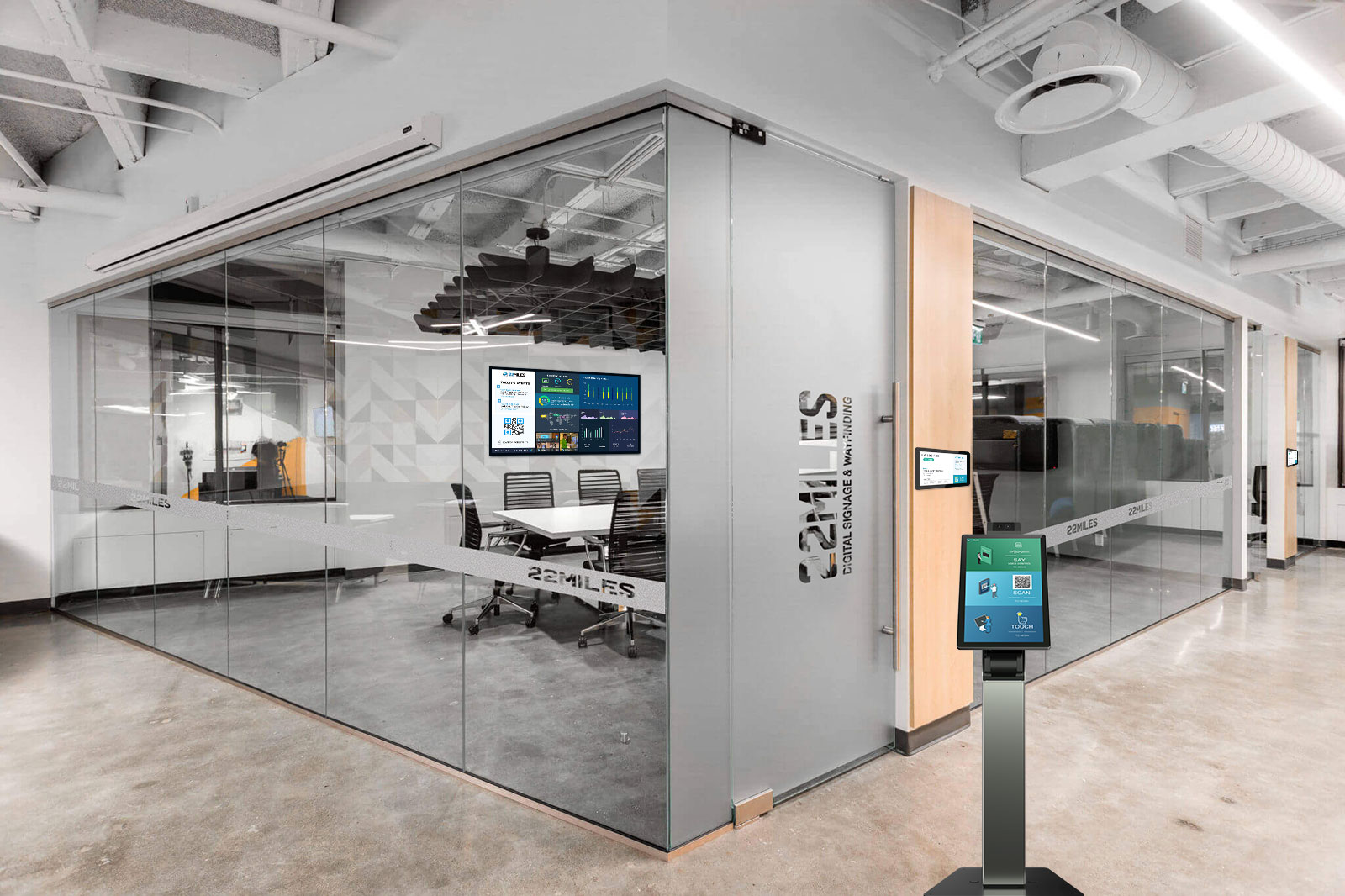
Digital panels, found outside clinics, elevator lobbies and in labeled information kiosks, were one of the most important elements of the design solution and the fd2s team worked very closely with the architect to develop the system of screens fully integrated into bands of glass on the walls outside each clinic. For ultimate convenience, the glass can be easily removed if and when screens, power sources or drivers need to be replaced. They also adhere to a three-color scheme of blue, orange and green.
These monitors also allow directional signage and directories to be updated easily to reflect changes to the layout of the facility as it adapts to new programs. Additional panels near the entrance to the building support the institution’s system of “Apple style” patient check-in and provide the “discovery experience” whereby patients can find information about MHealth, their condition and even determine if they are eligible for ongoing clinical trials.
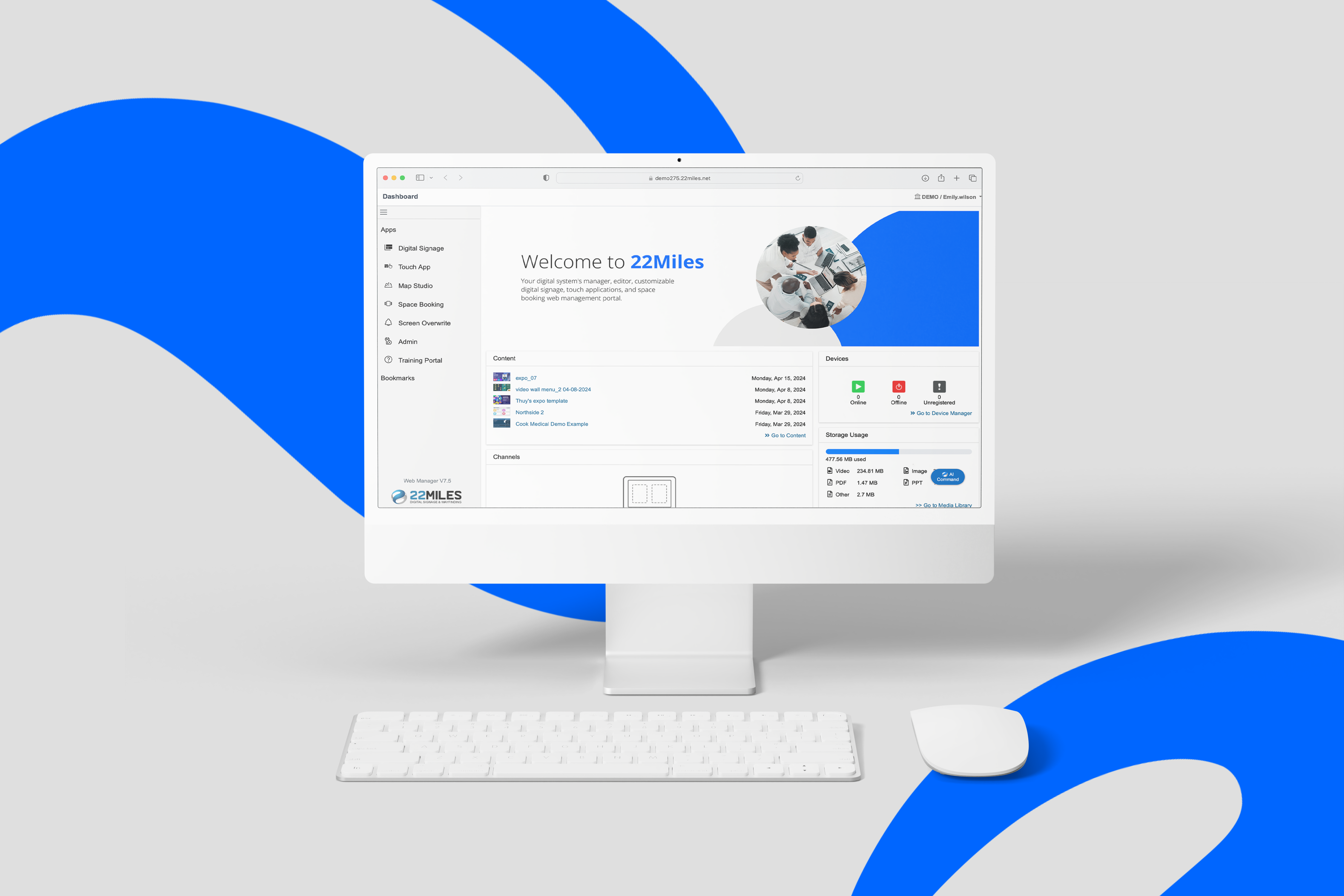
Because of the unique, frequently-changing needs of MHealth, the wayfinding content needed to be delivered dynamically through a cloud-based content management system. As a part of the design intent package, fd2s designed all the parameters for the content management system including screen flows, and 22 Miles was selected to develop and implement the CMS.
The CMS allows the client to manage, edit and schedule content for all of the medical digital signage system. That meant nearly 100 digital wayfinding and informational screens in the facility. “We worked with a great team from fd2s to the contractors and M Health IT to put this together,” says Tomer Mann, executive vice president and VP of sales and operations at 22 Miles, Inc. “With the amount of units deployed, it was a remarkably smooth installation.”
The smooth digital signage system setup came with one unforeseen hiccup, however; the original interface design for all of the screens used Helvetica, but each one also had a computer associated with it, therefore each instance required a separate license for the font. This created a potential added cost in the tens of thousands of dollars. The solution the design team found was to utilize an open source font, Tex Gyre Heros, that bears a close resemblance to Helvetica.
When it came to the roughly 1,200 analog signs, the architects requested that fd2s integrate them into the space and that no signs were suspended from the ceiling. “Because we’ve integrated so much into the architecture, what is there is subtle, integrated and simpatico with the architecture,” remarks Stamper. “And, if you need wayfinding information, it is readily available.”
The identification signage for departments, as well as elements for identifying levels, entries, or building amenities is suggestive of bold retail signage in line with the client’s goals. There are a few appropriate exceptions to the retail atmosphere, however. In the Masonic Cancer Clinic (one of the few named locations in the center) two enormous stone walls line the welcome area, sandblasted with stately lettering and masonic symbols as a nod to the donor organization’s past. Despite the differing materials and methods, this modern-meets-traditional, integrated approach to donor recognition feels congruent with the rest of the building.
Overall, the wayfinding designed by fd2s over a two-year span reinforces the institution’s commitment to creating a new approach to patient care, where clarity of experience and patient comfort are recognized as important contributors to successful outcomes. MHealth and the University of Minnesota Health are pleased with the results, as are the design teams.
“It’s not often the case that a client group invests this much energy into the patient experience; it was well-conceived and thought through from the beginning,” says Stamper. “We are honored to have worked on the project—it has been a great success for all involved.”
Project Name: MHealth Clinics and Surgery Center
Client: University of Minnesota Health
Location: Minneapolis
Open Date: January 2016
Project Area: 340,282 sq ft
Experiential Graphic Design: fd2s, Inc.
Fabrication: Archetype (fabrication)
Collaborators: 22 Miles (digital signage consultation and integration)
Project Budget: $350,000
Architect: Cannon Design, Studio Five Architects
Landscape Architect: Damon Farber Associates
Photos: Craig Dugan, Bill Klotz, Morgan Sheff, fd2s
More about the MHealth facility:


