Wayfinding in hospitals and medical office buildings is exceptionally challenging and rewarding. When designed correctly, efficiency increases from a wayfinding system can result in vast improvements to cost savings, patient experiences, staff engagement, and more. In the following article, we touch on fundamental aspects of designing a wayfinding signage system that meets the needs of its users.
Visually Cue
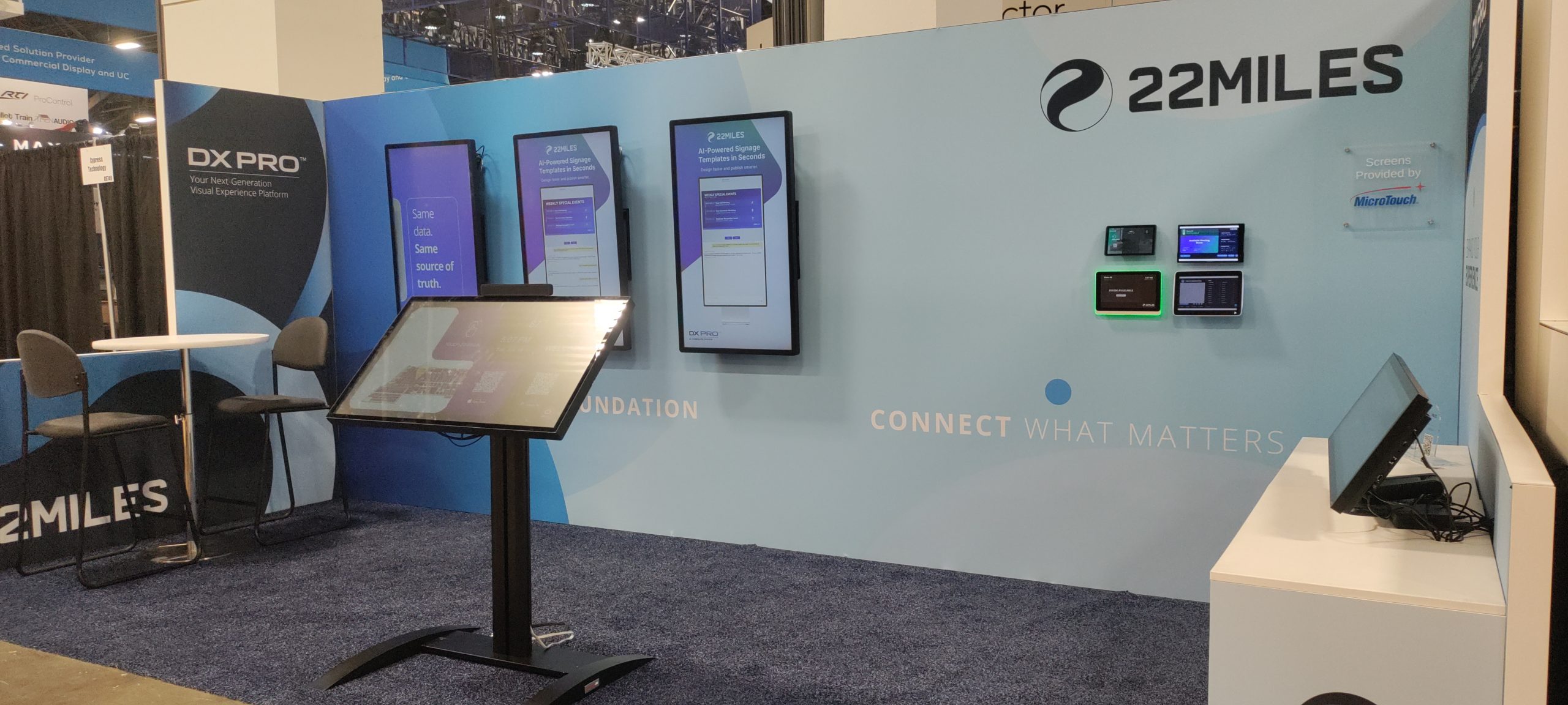
Coordinate wayfinding visuals to guide visitors with an easy-to-follow trail of digital breadcrumbs. The graphical elements can be diverse, but the arrangement should remain clear even when viewed at a distance. Wayfinding screens must always be unmistakable and easily read. And with consistent colors, fonts, and universal symbols, they are also intuitive and understandable. The screen designs in 22Miles Template Center are a great resource for any wayfinding signage system because they were designed specifically for visual clarity and branding consistency.
When placing digital screens, use a location strategy that guides visitors toward their destination. Wayfinding signs should be obvious, ensuring they are easily noticed and legible. Make floor plans and maps available at key locations throughout the facility, such as entrances and lobbies, to provide an overview of the facility and help visitors orient themselves. 22Miles Publisher Pro employs unique interactive 3D maps that enable visitors to familiarize themselves with the entire facility. Lastly, an often overlooked aspect of wayfinding signage systems is to design with the users in mind, considering their physical abilities and linguistic backgrounds. 22Miles CMS offers ADA-accessible interactivity, ADA routing, audible directions for the visually impaired, and support for dozens of languages.
Hierarchy and Consistency
When designing a wayfinding signage system, make the experience intuitive, effective, and user-friendly by applying fundamental hierarchy and visual consistency. You can guide users through facilities easily with a clear distinction between primary, secondary, and tertiary signage. With consistent visual elements throughout the wayfinding system, including typography, colors, symbols, and layouts, it delivers instant readability and is easy to understand. Ensure the design travels throughout the facility, including entrances, corridors, elevators, and other key traffic areas. Regularly review and update the wayfinding system to ensure it remains accurate to facility events like construction or maintenance, making it more relevant to users’ needs.
Synergistic Branding and Architecture
Integrating branding into hospital or medical office building wayfinding is vital to creating a consistent patient, visitor, and staff experience. The wayfinding signage system should incorporate the company’s brand identity, including its colors, typography, and imagery, for a consistent visual language that users can easily recognize and understand. One of the benefits of our AI-powered Template Center is that branded elements like these are automatically propagated to other templates, providing real-to-life views of all the screen designs.
Screens can also complement the architectural layout, materials, and design elements, such as lighting and furniture. Or, when visual interest is needed to draw visitors’ eyes, signs can be an architectural feature. If numerous or custom screen sizes are required to achieve the design, that’s okay; 22Miles CMS flexibly runs nearly every type of SoC and IoT device.
Additional Information
Offering additional information on hospital wayfinding signs can help users navigate more effectively and efficiently. Keep the additional information simple and easy to understand, avoiding complex medical jargon and technical terms. Use clear, concise language and provide only the necessary information for users to find their way. Additional information should be relevant to the user’s needs and location. For example, a sign in a waiting room might provide infotainment to help pass the time, while a screen in the cardiology department might provide information about support groups. Providing additional details on hospital wayfinding signs can enhance the user experience and improve navigation. By following these basic standards, designers can ensure that the information is clear, concise, and relevant to users’ needs.
As industry leaders in digital signage for hospitals and medical campuses, 22Miles’ innovative digital technology will help improve cost savings, patient experiences, staff engagement, and more.
Give us a call at (408) 933-3000 or complete our contact request form to book a demo with a real human on our team to demonstrate our robust CMS.